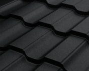
Matching classic or modern tile-effect metal roofing to the house
Tile-effect metal roofing
The choice between classic and modern metal roof tiles depends mainly on the geometry of the embossings, the colour and the way the roof is finished, not on the delivery format itself. Check how the profile’s rhythm relates to the proportions of the building, the width of the eaves and the details where the roof meets the façade. View a larger section of the covering and compare samples with the render and joinery, since a small swatch does not show the repetition of the embossings. Also compare options on projects with a similar roof pitch and size before deciding.
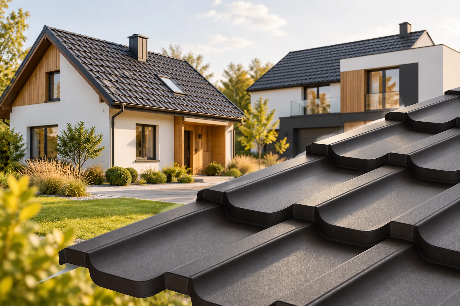
What creates the classic character of a covering?
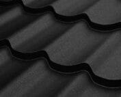
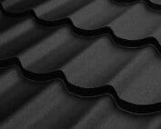
A gentle wave pattern and clear divisions resembling rows of tiles combine well with a traditional form. Such a roof can harmonise with the eaves, dormers and a warm façade colour scheme. However, it need not be limited to red or brown.
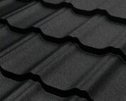
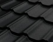
A graphite coating on a more rounded profile can also look calm and traditional. The impression depends on the whole building. It is worth viewing a larger section of the covering, because a single small sample does not show the rhythm of the repeating profiles.
What gives a more modern appearance?
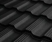
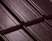
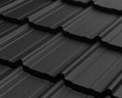
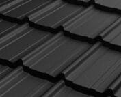
Clearer lines, a more restrained pattern and orderly edges can emphasise a simple form. Limiting the number of colours on the roof also matters. Flashings, gutters and accessories selected consistently with the covering are less distracting.
Not every house with a black roof looks modern. Proportions, the width of the eaves and the detail of the junction with the façade matter. A dark colour can emphasise an elaborate geometry just as much as a light one. The choice should therefore be assessed in the view of the whole house, not just the roof slope.
Module and cut-to-size sheet do not determine the style
The division into modular and cut-to-length tile-effect metal roofing concerns the delivery format and the way the material is laid out. Both groups include various shapes. A small module can have a classic wave, while a long sheet can have a more geometric pattern. These features should not be equated with one another.
The format is also chosen with regard to valleys, corners, transport and organisation of installation. When comparing appearance, these issues must be separated from the geometry of the pressings. This way you do not give up a suitable profile merely because of a mistaken association with sheet length.
How to match the scale of the pressings to the building form?
On a large, simple roof slope the rhythm of the covering is clearly visible. With many small sections, flashings and cut-offs may play a greater role. It is worth checking how the pattern looks at the roof valley, dormer and edge. A photo of a uniform catalogue fragment does not show these situations.
It helps to look at completed projects with a similar pitch and roof size. The same profile looks different on a low house with a wide eaves than on a tall, steep building. It is a good idea to precede the decision with a simple visualisation that preserves the real proportions.

Choose the colour together with the façade
It is worth comparing covering samples with the render, joinery and plinth finish. A large roof area intensifies the perception of colour, so a small sample can be misleading. View the sample in sun and shade. A phone screen will not show the exact shade or gloss.
The colour number does not describe the entire surface. Matt and gloss can produce a different effect even with a similar hue. Differences may also occur between coatings and delivery batches. It is worth agreeing a consistent variant for the covering and visible flashings.
The invoice is not a durability ranking
A matt surface softens light reflections, while gloss shows them more strongly. This is an aesthetic choice that does not determine corrosion resistance. The parameters should be read from the documentation of the specific coating system. Roughness is not proof of thicker or better protection.
For a house in a demanding environment, the technical selection should precede the decision on appearance. It is worth checking the conditions of use and maintenance. The chosen effect must fall within the variants suitable for the building. Not every coating is available in every colour and profile.
The final appearance is also shaped by details
The ridge, verges, eaves and chimney flashings can reinforce or disturb the character of the roof. Well-matched accessories create clear lines. However, a necessary element should not be removed just because it is visible. The function of drainage and ventilation must be preserved.
The geometry of installation is equally important. A crooked eaves and uneven rows will be visible regardless of the style of tile-effect metal roofing. It is worth looking at details completed by the chosen team. A photo of the finished slope from a distance may hide faults that are visible from the entrance or terrace.
How to make a choice without following fashion alone?
First, rule out models that are incompatible with the roof pitch and structure. Then choose two or three visually suitable options. Compare them on similar completed projects and with real samples. Finally, put together the full price, including flashings, accessories and the quantity of material ordered.
The roof will remain part of the building’s form even after the façade colour is changed. It is worth choosing a profile that suits the proportions of the house and your own preferences. A classic wave and a more restrained profile can be equally good choices. Quality is determined by the material, the design and the workmanship, not by a style label.
7 branches. Materials closer to your project.